
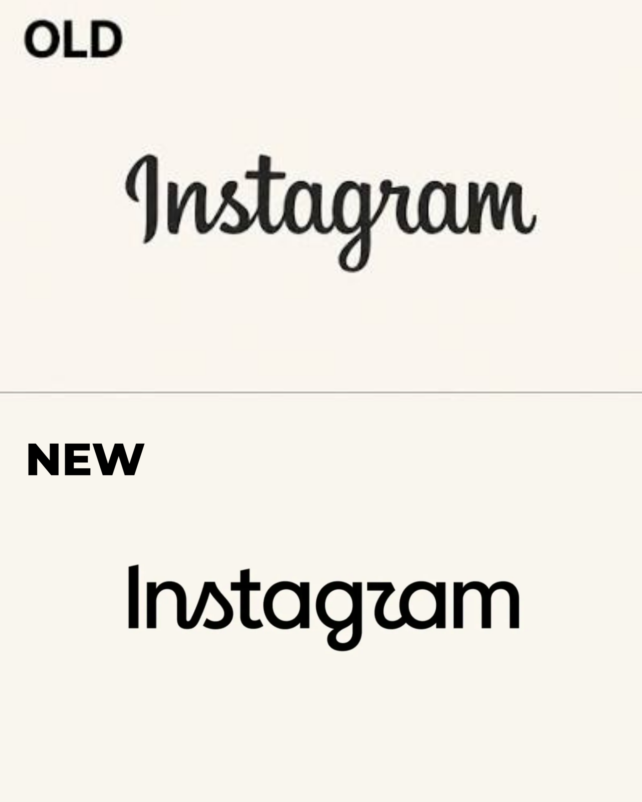


Instagram head Adam Mosseri unveiled the platform’s first wordmark redesign since 2016, replacing the familiar cursive italic script with a bolder, more compact typeface that the company describes as “sharper and more modern.”
The app icon- the pink, purple, and orange gradient square remains untouched. However, the text sitting above the feed now looks fundamentally different from the Instagram millions of users grew up scrolling.
The reaction was swift, predictable, and genuinely entertaining.
Within hours of the announcement, the mocking nickname “Instagzam” was doing the rounds on social media; a direct reference to the redesigned letter “r,” whose closed, angular shape mirrors the shape of the “g” beside it, making the logo appear to read something entirely different at first glance. Others compared the curved “s” to a small sailboat. Mosseri’s announcement post was filled with thousands of replies, with commenters split cleanly between those who welcomed the fresher look and those who mourned the loss of the warm, hand-drawn energy that the old cursive script carried.
Designers are equally divided. Some were relieved to see the wobbly cursive tidied up, while others were unconvinced by a mark that sits somewhere between script and sans-serif, neither fully committed to one typographic identity nor the other. Typography experts have praised the improved letter spacing and the elimination of awkward ligatures. Critics have called it generic, soulless, and indistinguishable from a default design template.
Here is where the story gets genuinely interesting for marketers. Within hours of the announcement, brands and creators across Instagram began rewriting their own names in the new Instagram font, turning a platform rebrand into a spontaneous, user-generated trend that nobody at Meta planned but everyone benefited from.
The trend is a textbook example of how the most powerful brand moments in the social media era are co-created rather than manufactured. Instagram did not brief brands to participate. It did not launch a hashtag campaign or commission influencers. It simply changed its font, and the cultural instinct of brands and creators to insert themselves into a trending conversation did not rest.
Furthermore, the brand comes with a broader system update. Instagram is introducing three typeface families alongside the new wordmark: Instagram Sans, a handwriting variant called Instagram Pen, and a monospaced option called Instagram Mono. Additionally, the signature gradient will be used more sparingly going forward, with refreshed motion, layout, and UI rolling out globally through 2026 and beyond.
Mosseri described the old wordmark as having “started to feel dated” after a decade in use. Moreover, the redesign follows similar updates Meta previously implemented for Facebook and Threads, bringing Instagram’s visual identity closer to the rest of the Meta family in a deliberate push toward a cleaner, more unified brand system.
The mixed public reaction to Instagram’s rebrand is a reminder that no logo change, however well-executed, escapes scrutiny at scale. Nevertheless, Instagram’s brand equity is so deeply embedded in global culture that a font change, however divisive, cannot meaningfully displace it. Therefore, the lesson is not that rebrands are risky. It is that brands strong enough to absorb the criticism of change are the ones that have built something worth protecting in the first place.
ALSO WATCH: MARKETING EDGE ONTV




Comment
No comments found.