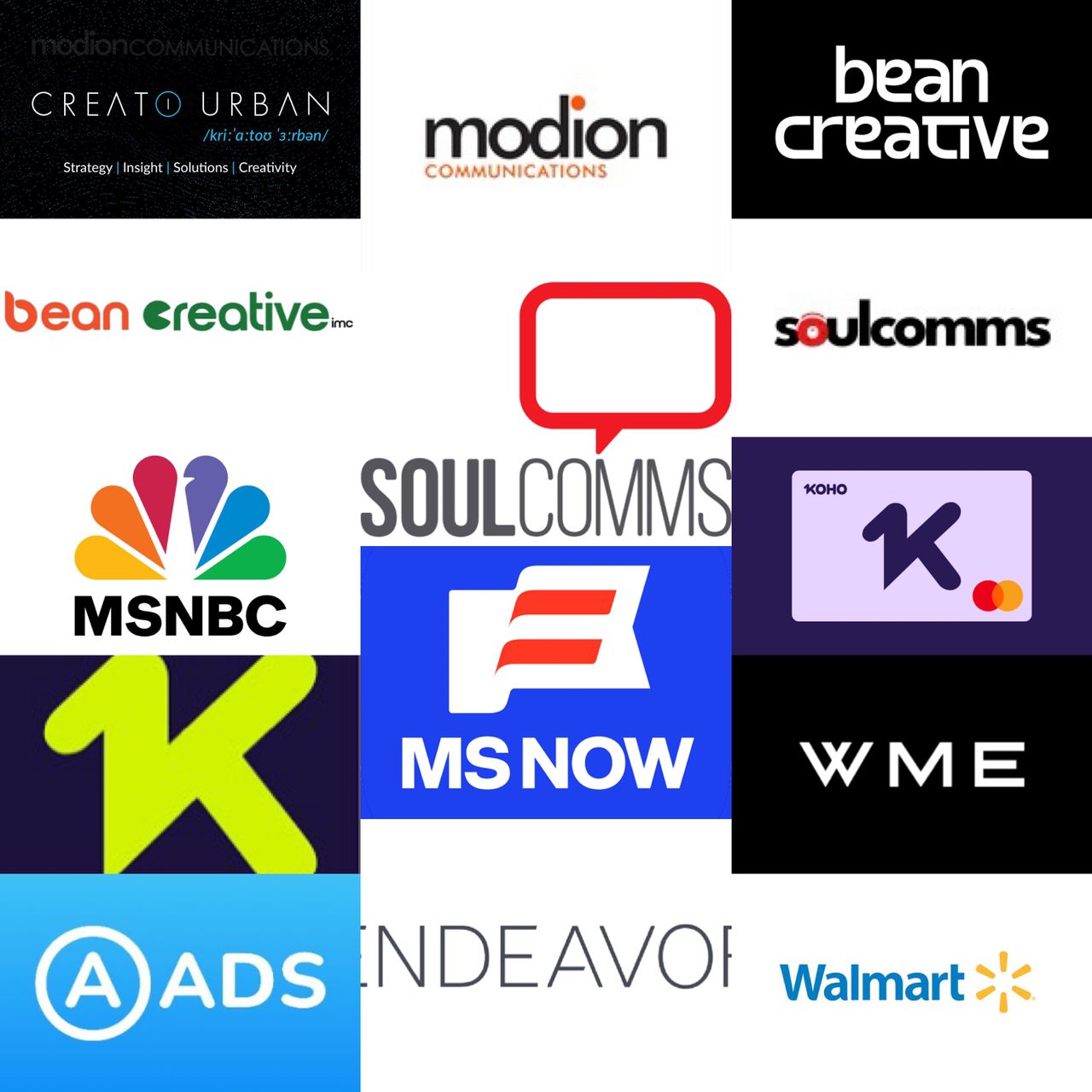
The year 2025 saw significant rebranding activity across advertising, marketing communications, and creative agencies globally. Specifically, Nigerian agencies led a notable transformation. They positioned themselves for international recognition and digital-first capabilities. Consequently, name changes reflected expanded service offerings. Visual identity refreshes signaled cultural shifts. Agencies demonstrated that rebranding remains a powerful tool for communicating strategic evolution.
Nigerian Agencies Lead African Transformation
Modion Communications rebranded as Creato Urban in December 2025. This marked a transformative milestone as the agency celebrated a decade of creativity. The new name, pronounced /kriːˈɑːtoʊ ˈɜːrbən/, unveils a renewed identity. It reflects expanded capabilities and bold global aspirations.
Over its 10-year journey, Modion Communications delivered some of Africa’s most impactful campaigns. These spanned more than 20 industries. Furthermore, the agency won the prestigious SABRE Platinum Award. It was the first and only Nigerian PR agency to receive this honour. Additionally, it emerged as the first African PR agency to win the ICCO Next Gen World Cup. The rebrand to Creato Urban represents an evolution. It moved from a PR-focused firm to a fully integrated communications powerhouse.
Similarly, Bean Creative rebranded to Bean Creative IMC. This reflects its bold transition into a fully integrated marketing communications firm. The agency now serves clients across talent management and new media. It also handles PR and creative advertising across all disciplines. To drive this chapter, Bean Creative IMC appointed Anthony Onyemauwa as Vice President and Agency Lead. The rebrand signals an ambition to scale into a respected global company born out of Africa.
Soulcomms also unveiled a comprehensive rebranding initiative. This celebrated its 20-year evolution into a digital innovation trailblazer. The agency introduced a refreshed logo and identity. Specifically, it reflected the integration of augmented and virtual reality. It also highlighted retail tech solutions and cutting-edge digital capabilities. The new logo features a sleek, dynamic design. Moreover, the distinctive “O” radiates from the core. This symbolizes energy and a commitment to unforgettable experiences. The rebrand was accompanied by the appointment of Ayodeji Onabajo as COO.
Global Agency and Brand Transformations
Endeavor became WME Group following Silver Lake’s $25 billion transaction. After selling or spinning out most assets, the renamed company put the talent agency front and center. Consequently, it moved away from a “house of brands” structure. This highlight’s WME’s core business.
A-ADS evolved to AADS by dropping the hyphen. This was its first radical rebranding since 2011. Furthermore, the change reflected a shift from a niche Bitcoin network to a mainstream crypto solution. AADS explained the dash confused users in search engines. The cleaner name better represents a future-ready identity.
In the tech sector, Apple TV dropped the ‘+’ symbol. It introduced a new visual brand featuring a liquid glass effect. This pays homage to Apple’s 1979 rainbow logo. Instead of using AI for the design, Apple opted for a handcrafted physical glass logo. Similarly, ESPN killed its ‘+’ punctuation. Both brands favored a cleaner, streamlined look.
MSNBC rebranded to MS NOW as part of a Comcast spin-off. The rebrand created independence while maintaining continuity. Despite initial online mockery, ratings increased and audiences adapted. Meanwhile, Amazon unveiled a new logo for the first time in 20 years. Developed with agency Koto, it unified over 50 sub-brands. As a result, it became a masterclass in tuning a brand without breaking it.
Walmart updated its logo with a subtle redesign. It made its “spark” motif fuller to reflect its status as a tech-powered retailer. The refresh included a new color palette and a bold new font. Likewise, Adobe partnered with Mother Design for a brand refresh. It featured a confident new logotype paying homage to the original 1982 design. This approach realigns the brand without alienating long-term users.
Koho, the Canadian fintech, delivered a standout logo redesign. The new neon logo represents the energy behind hard-earned dollars. Furthermore, Eventbrite partnered with BUCK and Instrument for a refresh. It featured an updated logo icon called “The Path.” This rebrand flipped the script on event discovery with a mobile-optimized experience.
Strategic Implications
The 2025 rebranding wave revealed several strategic imperatives. First, Nigerian agencies demonstrated confidence in their ambitions. They moved beyond regional positioning to claim space on the global stage. Specifically, the transformation of Creato Urban and Bean Creative IMC shows a shift. African agencies are now sophisticated, integrated firms capable of competing anywhere.
Digital transformation remained a primary driver. Agencies like Soulcomms emphasized AR, VR, and retail tech. In addition, the integration of “IMC” reflects a shift toward full-service offerings. For global brands, the activity showed the challenge of modernizing without losing equity. Amazon and Walmart represent a mature philosophy focused on refinement.
Finally, the death of the “+” symbol reflects digital realities. Simplicity and clarity matter most in a mobile-first world. In summary, 2025 marked a coming-of-age moment for African agencies. Their strategic thinking now commands respect on the world stage.
ALSO WATCH MARKETING EDGE ONTV


Comment
No comments found.