By Felicia Nwosu
Mountain Dew is set to introduce a refreshed visual identity as it returns to its mountain-inspired roots, according to a report by Marketing Dive.
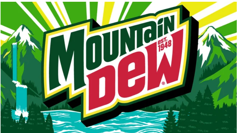
The redesign includes a new logo that incorporates the brand’s iconic topography and revives a retro, three-dimensional font spelling out the full name “Mountain Dew,” replacing the “Mtn Dew” abbreviation used for over a decade. The update aims to evoke the soda’s citrus-flavored refreshment while celebrating outdoor adventures and the joy of spending time with friends.
The new look is expected to roll out across the U.S. next summer on all brand touchpoints, including packaging, promotional materials, and consumer experiences.
PepsiCo’s senior vice president and chief design officer, Mauro Porcini, described the redesign as a harmonious blend of modernity and nostalgia.
JP Bittencourt, vice president of marketing at Mountain Dew, highlighted the importance of how the brand presents itself visually, explaining that after a review of their positioning, it became clear that a visual refresh was necessary to make a significant impact. The redesign follows recent marketing campaigns that have revived the brand’s iconic tagline “Do The Dew,” introduced a new mascot called the Mountain Dude, and claimed the Mountain Time Zone as a signature territory for the brand.
Bittencourt further noted that this shift represents a move away from the brand’s previous individualistic, extreme image toward a more refreshing, inclusive positioning that reflects the evolution of its consumer base. The new logo, designed by PepsiCo’s in-house Design & Innovation team, incorporates citrus-inspired yellow tones and soft-edged typography reminiscent of the 1980s and 1990s, paying homage to the brand’s heritage. It also features the year of Mountain Dew’s founding, 1948, and a citrus leaf icon over the “i” in “Mountain,” symbolizing the brand’s enduring connection to its roots.


Comment
No comments found.