By Kasim Bakare
Generally, logo designs can be seen as the foundation of a brand’s identity. A logo is a display of a brand’s unique experience and identity, providing essential information about the brand. It is a shorthand way of referring to a business in marketing and advertising materials like stationery, business cards, websites, and advertising. Customers get an idea of what a brand is all about the moment they see the logo.
The substance of a logo in portraying a brand identity goes beyond saying. Essentially, a logo should be able to stand on its own, and its significance should be easy to explain to someone who is interested in learning about the brand. A symbol shouldn’t depend on text so that it is recognizable in any language. This helps to extend the overall reach of the brand.
Specifically, a brand should be distinct and recognizable. Chances are you know what a red bull’s eye represents (Target), and a half eaten apple clearly represents the tech giant, Apple. Simply put, having a logo that immediately makes consumers think of your brand increases their chances of using your product/service when they are in search of one.
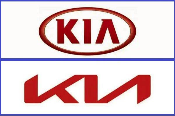
Recently, leading South Korean auto brand, Kia unveiled a new logo to signpost a re-branding move that also included the dropping of “Motors” from its corporate name. The new logo came without noticeable features of the old logo which had a distinctly recognizable text (KIA) and a circle round the text. According to KIA, the strategy was meant to reposition the brand as a mover in electric vehicles and mobility. The new logo was unveiled during a record-breaking pyrotechnic display in the skies above Incheon, Korea. The event saw 303 pyrodrones launching hundreds of fireworks in a synchronized artistic display, igniting and celebrating KIA’s new beginning.
Beyond the pomp and pageantry that heralded the global launch of the new logo, creative experts in Nigeria’s Integrated Marketing Communication (IMC) industry have expressed divergent views on the new logo, highlighting the effect of the re-branding strategy on the brand’s identity viz-a-viz the perceived inability of the logo to deliver its purpose in the short term.
Commenting on the subject matter, Senior Deputy Creative Director, SO&U, Abraham Cole, noted that the new logo does not clearly depict the auto brand’s identity. Hear him: “The new logo was unnecessary as it doesn’t seem to resonate with the brand’s consumers. The old logo was simple and elegant. Personally, I feel what KIA should have done was to improve on the old logo rather than take certain important aspects of the logo off completely. The new logo doesn’t seem recognizable.”
Corroborating Cole’s position, GMD Republicom Group,Tunji Adeyinka noted that the first job of a good logo is ‘recognition marking’. According to him, the primary role of a logo is to communicate who you are and to differentiate your brand visually from other brands. He also noted that the logo being key part of a brand identity communicates what the brand represents.
Providing more details on the ‘faux pas’, the creative impresario had this to say: “I think the designers prioritized design principles like symmetry and balance over brand recognition. A logo must first be recognizable, aesthetics can then follow. How can I move to memorability if there is no recognition?” He asked rhetorically. ‘The new logo is the KIA name freely written by hand. Indeed, the old logo needed a change. It could have been easier if the designers retained some elements from the old logo,” he added.
Expressing a different opinion, Deputy Creative Director, SO&U, Tolu Bamgbose posited that the entire re-branding strategy by KIA was designed for its future. His words: “The removal of ‘motors’ is an attempt to prepare for a diversified future for the brand. Brands like Apple started whispers of going into electric car production. Currently, they have a series of brands beyond phones e.g smart watch, PC, TVs, etc. Google today has gone into video game console production. It’s called Stadia. Perhaps, Kia plans on diversifying beyond ‘motors’. So I will say it’s deliberate and a good thing. On the other hand, if the visual change of the KIA is too far from what it was, the brand might be unrecognisable to people for a while.”
Asked to comment on the seeming inability of customers and potential customers to recognize the new logo, the creative wizkid had this to say: “It has its down side, but it is a necessary sacrifice if you are going to change your look. The brand is big enough that the news of its change will spread far and wide enough that in a few months they will be as recognizable as they were before the change. I will like to believe they would have new marketing campaign to hasten awareness of the change. What they also want to achieve is a more innovative modern look, so I’ll say the eventual benefit outweighs the down side within this window change”.
In his reaction, Marketing Manager, Dana Group, the sole distributor of KIA in Nigeria, Mr Olawale Jimoh, noted that the change signifies the company’s evolution. He reiterated that the auto brand is channeling its genius to maximum customer satisfaction not just in the production of auto masterpieces.
“It is not just to surprise the customers with new designs and new technology that will wow them. It is more of creating a space where people will be in their cars and be inspired to do more. It is more customer-oriented.
“It is more like having cars that will do more than conveying you from one place to the other. It is a car that will communicate with you”.


Comment
No comments found.