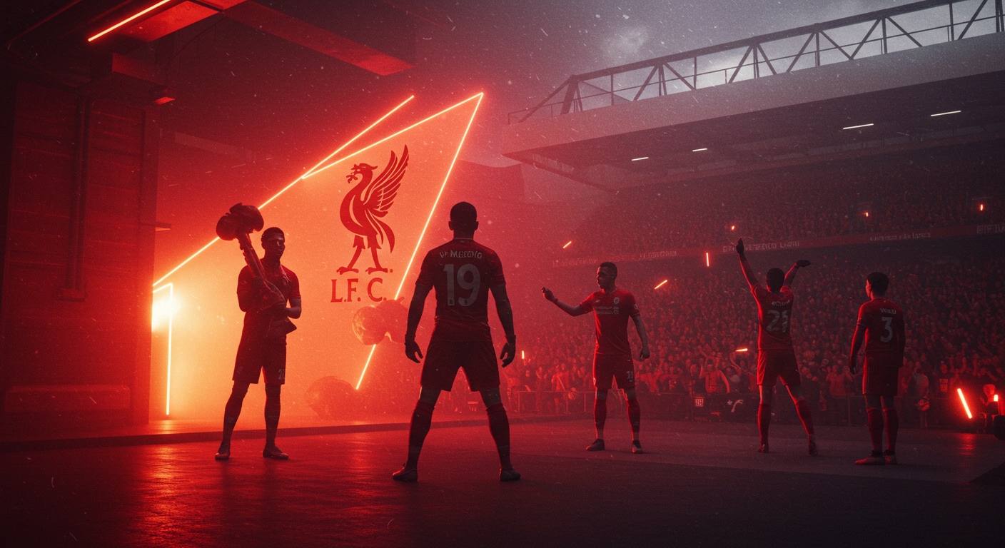
In a world where brand power frequently outranks on-field success, Liverpool FC has made a significant move. This bold step could change how football clubs communicate with global fans and partners. The Premier League titans, rooted in nearly a century of tradition, are taking a brave stride into the future. They are redesigning their identity. This redesign not only honors their past but also supercharges their legacy for a new generation. If early signs are anything to go by, Liverpool isn’t simply chasing championships; they are creating a brand as timeless and compelling as the sport itself.
Reimagining a Century of Grit
For decades, Liverpool FC’s identity revolved around grit, passion, and the roar of Anfield. Despite emotional highs, the club lacked a continuous, scalable brand system. Today’s global stage demands such a system. Their 2025 brand transformation addresses this. This purposeful transition moves from fragmented images to a unified, strategic identity. This new identity expresses “Scouseness,” the city’s fierce pride and wit. Crucially, it also fulfills the commercial demands of modern marketing giants like Nike and Google.
The Art of Reframing: Bulletproof’s Vision
“We realized football clubs have iconic crests but often no real brand architecture,” stated David Beare. He is the executive creative director of Bulletproof, the agency leading this initiative. “Our task wasn’t to redesign Liverpool; it was to reframe it.”
They reframed it by enhancing the Liver bird, Liverpool’s ancient icon. Consequently, they converted it from a static badge to a live, breathing force across all platforms. Custom typefaces, inspired by the bird’s wings and claws, now exist. Furthermore, a refined color palette, based on the club’s original red, adds to its appeal. Responsive design components that react to the beat of Anfield shouts further enhance the brand’s emotional intelligence. In summary, Liverpool’s new identity is more than just aesthetically pleasing; it possesses a vibrant feel.
Emotional Resonance: The New Imperative
In the age of AI-powered marketing and hyper-personalized fan experience, emotional resonance is no longer a luxury. Instead, it has become a requirement. According to McKinsey’s 2024 Branding Trends Report, brands focusing on emotional authenticity increase client lifetime value by up to 23% more than competitors. Liverpool, therefore, appears set to ride that wave, all without losing its soul.
Commercial Success & Future Strategic Shifts
Commercially, the initiative is already producing results. Despite failing to qualify for the Champions League last season, Liverpool increased commercial revenue to a record £308 million. This demonstrates that brand equity can compensate for on-field setbacks. The move also prepares the way for significant future changes. These include a potential switch from Nike to Adidas uniforms by 2025. This could, furthermore, integrate the club’s new typefaces, colors, and patterns into global fan culture.
A Blueprint for Modern Football Brands
Marketing specialists suggest Liverpool’s revamp could influence other football giants. It may change how they approach brand consistency. Clubs surviving the next decade will not just win games; they will win hearts and mindshare.
Unlike many sports rebrands that chase sleekness at the cost of identity, Liverpool’s approach strikes a rare balance. It is clean without being sterile. Moreover, it is progressive without being pretentious. It doesn’t erase history; rather, it weaponizes it. Ultimately, it’s a reminder that in branding, just like in football, the greatest successes aren’t simply about reinventing yourself. They are about remembering who you are, and then communicating that story louder, sharper, and wiser to the world.
Liverpool FC’s message is clear: This Means More. Now, it looks and feels that way.
Read also: Branding for growth: why emerging markets hold the key to premiumisation


Comment
No comments found.