For many years, logos have served as the most consistent elements in brand storytelling. They endure beyond campaigns and persist through many CMOs. In certain instances, they even withstand entire generations of consumers. That is exactly why altering them is never a neutral action.
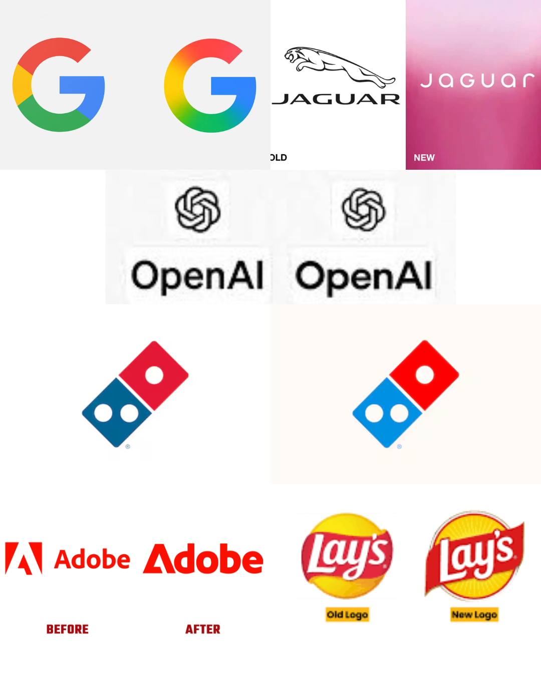
Over the past year, several of the world’s most recognizable brands opted to refresh their visual identities. These included Google, Jaguar, Domino’s, Adobe, Lay’s, and OpenAI. Some brands did so with a sense of quietude. Others ignited intense discussion. Collectively, they uncover a profound tension influencing contemporary branding. This tension pits the urge to appear future-ready against the danger of obliterating valuable memories.
This year was not solely about superficial updates. The year revealed how branding choices sit at the crossroads of technological changes. They also reflect platform dynamics and cultural confidence.
Subtlety as Strategy: Google and Adobe’s Quiet Evolution
Google’s upgrade scarcely registered as “news” to the casual observer. This was exactly the point. The multicoloured wordmark stayed intact. However, changes in spacing, balance, and colour gradient indicated something more strategic. These shifts signal a brand built to live everywhere at once.
As Google’s products merge into AI assistants and ambient computing, its identity must function as a dynamic system. This was not a transformation. Instead, it was a commitment. The company recognized that familiarity, rather than innovation, is its most valuable asset.

Adobe applied a comparable reasoning. The updated identity enhanced visual consistency throughout a growing ecosystem. This ecosystem now extends far beyond creative software into AI-driven tools like Firefly. The redesign focused on alignment rather than spectacle. It aimed to ensure that the brand communicates effectively with all creator audiences. In both instances, the brands illustrated a key lesson. Occasionally, the most intelligent redesign is the one that chooses not to make a grand statement.
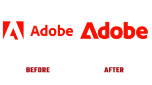
Adobe
Reinvention at a Cost: Jaguar’s Clean Break
If Google refined, Jaguar ruptured. The rebranding of the British automaker signified a conscious move away from its legendary leaping cat. This symbol holds deep associations with performance and British luxury. A sleek, contemporary wordmark emerged in its place. This reflects Jaguar’s shift towards being an electric-first, ultra-premium brand.
From a strategic perspective, the reasoning is clear. Jaguar no longer relies on nostalgia for its competitive edge. Instead, it focuses on a future characterized by electrification and minimalist design. However, branding is not confined to strategy boards alone. It resides within the collective memory of the public.
To numerous observers, the redesign appeared to be more of an erasure than an evolution. The backlash highlighted a persistent danger in legacy rebrands. Modernity may come across as empty when firms strip away heritage too quickly. Jaguar’s case serves as a reminder to the industry. True boldness in branding depends on the ability to convey a narrative effectively.
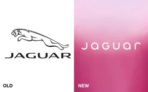
Jaguar
The Digital Shift: Domino’s and OpenAI
The redesign of Domino’s generated significantly less controversy. This occurred primarily due to its alignment with existing consumer engagement. Ordering has transitioned firmly to apps and mobile interfaces. Consequently, the company persisted in its evolution away from explicit “pizza” references. It moved toward a streamlined, digitally native identity.

Domino’s
The change in the logo was not merely for visual appeal. Instead, it reflected the brand’s values and actions. A new kind of significance was attached to OpenAI’s upgrade. The organization’s brand had to convey reliability and credibility as AI entered the real world. With this updated logo, OpenAI continues its evolution into a worldwide platform. It becomes a brand that is responsible to more than just developers. In both instances, the redesigns succeeded because they addressed actual usage.
OpenAI
The Grey Zone and the Future of Identity
Lay’s exists in a somewhat unclear position. The refinements to its logo aimed to enhance digital clarity and shelf visibility. However, the response revealed a common feeling among consumers. When people cherish a brand for many years, even minor alterations can seem unwarranted.
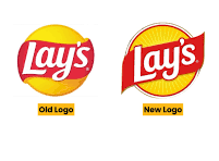
Lay’s
For mass FMCG brands, familiarity is the essence of the product. Visual updates may seem like change for the sake of change if they provide no distinct advantage. Collectively, these redesigns illustrate a branding environment facing significant challenges. Technology cycles are becoming shorter. Platforms require more adaptability. AI is transforming the way brands present themselves. In that setting, remaining motionless can seem perilous.
What This Year’s Logo Changes Really Tell Us
Collectively, these redesigns illustrate a branding environment facing significant challenges. The cycles of technology are becoming shorter. Platforms require adaptability. AI is transforming the way brands present themselves, communicate, and interact. In that settling, remaining motionless can seem perilous.
But the year also highlighted a simple truth: not every logo needs to be saved.
The most impactful brand updates were fueled by authentic transformation, changes in business model, user behaviour, or cultural responsibility. The most debated ones faltered as visual transformation outpaced significance.
As brands move forward, the message is evident. A logo is not a reaction to trends. It is a commitment. Once changed, it cannot be easily reverted without incurring expenses.
In this age of constant innovation, moderation might emerge as the most daring branding decision ever.
ALSO WATCH MARKETING EDGE ONTV






Comment
No comments found.