Not every New Year arrives with noise.
Some emerge silently, in the steam rising from a cup, in the rhythm of a familiar habit, or in everyday objects we touch without thinking. As 2026 began, a number of brands realized something important: the New Year did not need to be declared. It has to be felt.
Instead of fireworks-heavy clichés, these artists embraced intimacy, culture, and meaning. They did not shout “Happy New Year.” They explained what a new year entails.
The Art of Atmosphere and Ritual
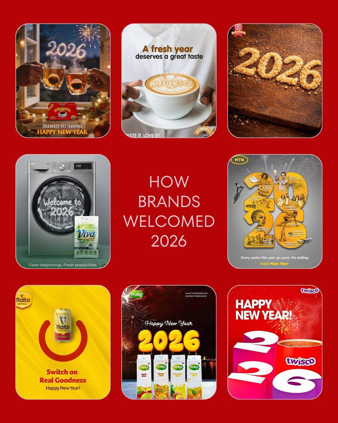
Top Tea’s creative does this pretty effortlessly. Two glasses raised near a window; fireworks reflected but never centred. The year “2026” appears not as font, but as atmosphere, warm, radiant, and human. The brand does not detract from the moment; rather, it fits right in. The tea is not a prop. It is the reason this moment exists at all.

Top Tea Creative
Cowbell Coffee adopts a similar restrained approach, but directs the feeling inward. A single cup. Latte art that spells “2026.” Steam curled upward, like a gentle promise. The slogan is simple; A new year deserves a delicious taste, but the message is deeper. This isn’t a celebration. It’s about the ritual. Regarding the morning after. About restarting gently.

Cowbell Creative
Craftsmanship and Cultural Allegory
Rehoboth Bakery goes back much further, to texture, workmanship, and tactility. “2026” is spelled out in breadcrumbs on a wooden surface. There is no surplus copy. No gloss. Just evidence of the procedure. Of hands. Of making. It feels almost symbolic: a fresh year formed by what we already know.

Rehoboth Creative
Viva transforms a common appliance into a cultural allegory. Inside the washing machine, fireworks whirl like water and light. “Welcome to 2026” appears as motion, rather than spectacle. The concept is simple yet powerful: new years are a time to clean up, reset, and start again. Start fresh. New possibilities. The brand does not explain it. It allows the visuals to do the work.

Viva Creative
Local Hustle and Real Goodness
MTN’s execution takes a completely different tone, but with the same purpose. The digits “2026” contain stories about movement, ambition, hustle, and ordinary Nigerian life. The language is local. The pictures are purposeful. This is not a distant future; it is based on real experience. MTN does not greet the year; rather, it claims it.

MTN Creative
Malta Guinness keeps things bold and symbolic. A bright yellow field. The Power Icon. One directive: “Switch on Real Goodness”. It feels more like a mindset than just a welcome. A reminder that the coming year is something you should actively pursue rather than passively anticipate.
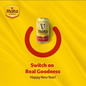
Malta Guinness Creative
Familiarity and Bold Presence
Frutta leans toward familiarity. Fireworks in the backdrop. Products are front and center. The year hovers above like a balloon. It makes no attempt at abstraction or metaphor, which is precisely why it succeeds. Presence is sometimes used as a technique.
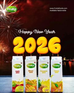
Frutta Creative
Twisco, on the other hand, is confident in its visibility. Large numerals. The hue is strong. Immediate recognition. There’s no distraction. Simply the assurance of a brand that understands where it belongs when attention is at its peak.

Twisco Creative
A New Era of Brand Interpretation
Taken together, these New Year’s creatives demonstrate a subtle shift in how businesses approach occasions that were once considered compulsory.
Less noise.
More meaning.
Less announcement.
More interpretation.
The most captivating New Year campaigns of 2026 did not attempt to seize the moment. They respected it. In doing so, they reminded us of a crucial point: when brands understand culture, they don’t need to say much.
ALSO WATCH MARKETING EDGE ONTV




Comment
No comments found.