By Kehinde Fashua
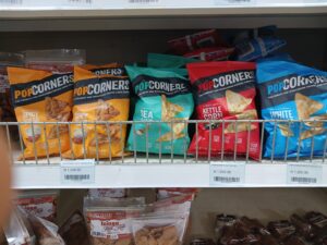
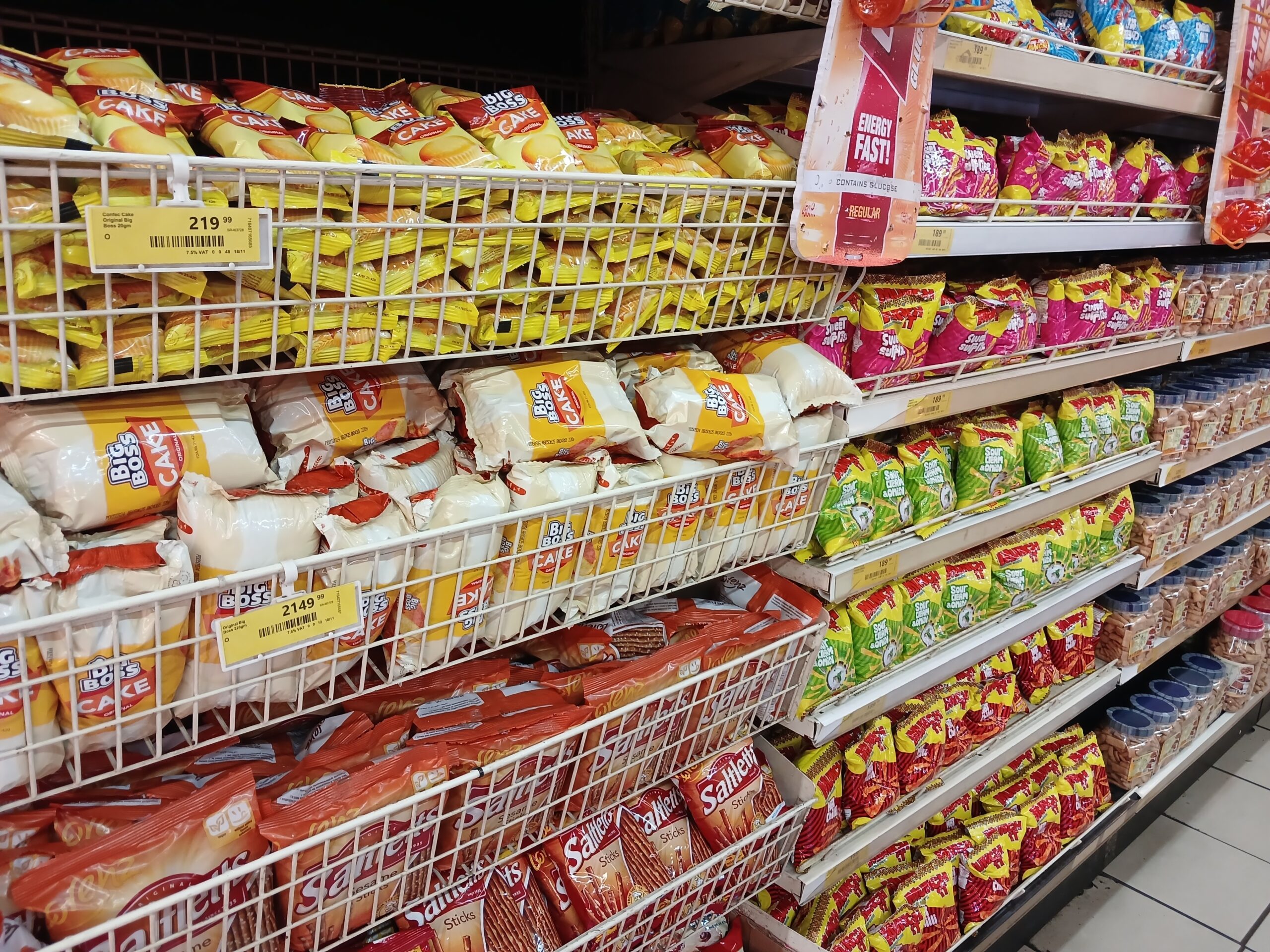
In the ever-evolving world of packaging design, colour blocking has emerged as a powerful strategy for brands seeking to make an instant impact on consumers. Though not a new design technique, its growing prevalence in product packaging, especially in the snack category, reflects its effectiveness in driving attention and engagement on store shelves.
At first glance, the vibrant and bold blocks of contrasting colours instantly draw attention, making products impossible to miss even in the most crowded aisles. In fact, this visual approach appears to be gaining momentum as brands aim to navigate the complexities of modern retail environments, where products must fight for space in a sea of competing choices.

So, why is this becoming such a prominent trend? Colour blocking works on multiple levels. For one, it is an extremely effective way to create visual hierarchy. Bright, contrasting colours can be used to highlight key elements of the packaging, such as brand logos, product names, or even nutritional information, ensuring that crucial details stand out immediately. This strategy plays directly into the psychology of decision-making, where consumers, often in a rush or overwhelmed by choices, are subconsciously attracted to products that catch their eye at first glance. It’s a simple yet powerful strategy that taps into the human tendency to notice bold patterns or combinations of colour.
Additionally, colour blocking adds a layer of modernity and freshness to packaging design, which is particularly important for products in the highly competitive snack category. In today’s consumer-driven market, snack brands are not just selling a product—they are selling an experience. Packaging serves as a visual communication tool that speaks to the consumer’s desire for convenience, excitement, and trustworthiness. Colour blocking, with its clean lines and bold contrasts, gives the impression of a brand that is fresh, dynamic, and willing to push creative boundaries.

Beyond visibility, colour blocking also plays into brand differentiation. In snack aisles, where products often look remarkably similar, brands are looking for ways to stand apart. By using distinct and innovative colour combinations, brands can carve out a unique identity that resonates with their target market. Whether it’s an organic snack brand using earth tones for a natural feel, or a bold, indulgent brand choosing neon hues to reflect excitement, colour blocking helps make the brand’s personality clear from the first glance. In a way, the design becomes an extension of the product itself—reflecting the mood, tone, and promise the brand aims to communicate.
What’s more, colour blocking allows brands to target specific consumer segments with tailored designs. For example, health-conscious snack brands might opt for minimalist, pastel colour palettes that evoke feelings of calm and purity, while indulgent, indulgent snack brands could use high-contrast, energetic colours to evoke excitement and a sense of indulgence. By understanding their audience, brands can use colour strategically to speak directly to the emotional triggers that drive purchasing decisions.
While this trend is certainly not new, it’s clear that colour blocking is evolving into a go-to strategy for standing out on the shelf. As we continue to see more snack brands adopt this approach, it will be fascinating to see how it evolves in terms of colour combinations, shapes, and layouts. In a marketplace where consumer attention spans are shrinking and competition is growing, colour blocking is proving to be an effective way for brands to capture attention, convey their identity, and ultimately influence purchasing decisions.
In all, the use of colour blocking in snack packaging design isn’t just a trend, it’s a powerful strategy that drives visibility, reinforces brand identity, and appeals to the subconscious minds of consumers.
If your brand isn’t already experimenting with this strategy, it might be time to consider it. In the world of fast-moving consumer goods, standing out has never been more critical, and colour blocking could be the key to ensuring your products make a lasting impression.


Comment
No comments found.